
Craig Hockenberry:
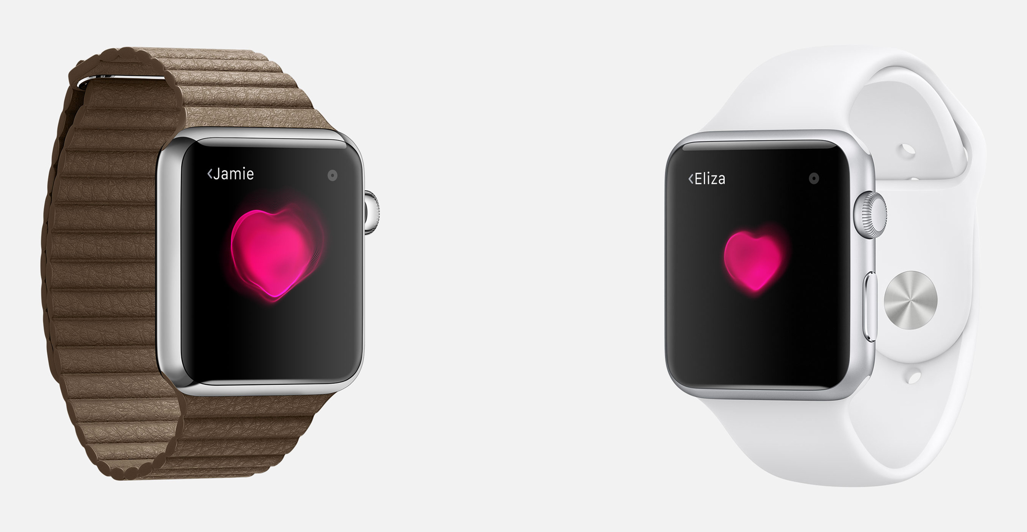
One of my first impressions of the WATCH user interface was that it used a lot of black. This makes the face of the device feel more expansive because you can’t see the edges. But more importantly, those black pixels are saving power and extending the life of the display. It’s rare that engineering and design goals can align so perfectly.
And from what we’ve seen so far of the watch, that black is really really black. We’ve become accustomed to blacks on LCD displays that aren’t really dark: that’s because the crystals that are blocking light let a small amount pass through. Total darkness lets the edgeless illusion work.
Craig zwraca też uwagę na „spłaszczenie” iOS-a przy okazji debiutu iOS 7 – bez tego nie byłoby spójności pomiędzy Watchem, a iPhonem czy iPadem. iOS nie musiał otrzymać nowego designu, ale nie wyobrażam sobie takowego na zegarku Apple’a – wyglądałoby to w najlepszym wypadku komicznie. Jestem w każdym razie ciekawy jak to będzie wyglądało na żywo, gdzie przez „to” mam na myśli pierwszy ekran AMOLED wykorzystany przez firmę z Cupertino. Na szczęście w odróżnieniu od niektórych producentów nie zastosowali matrycy PenTile i wierzę, że kolory nie będą przesycone.
Chcesz zwrócić mi na coś uwagę lub skomentować? Zapraszam na @morid1n lub na forum.