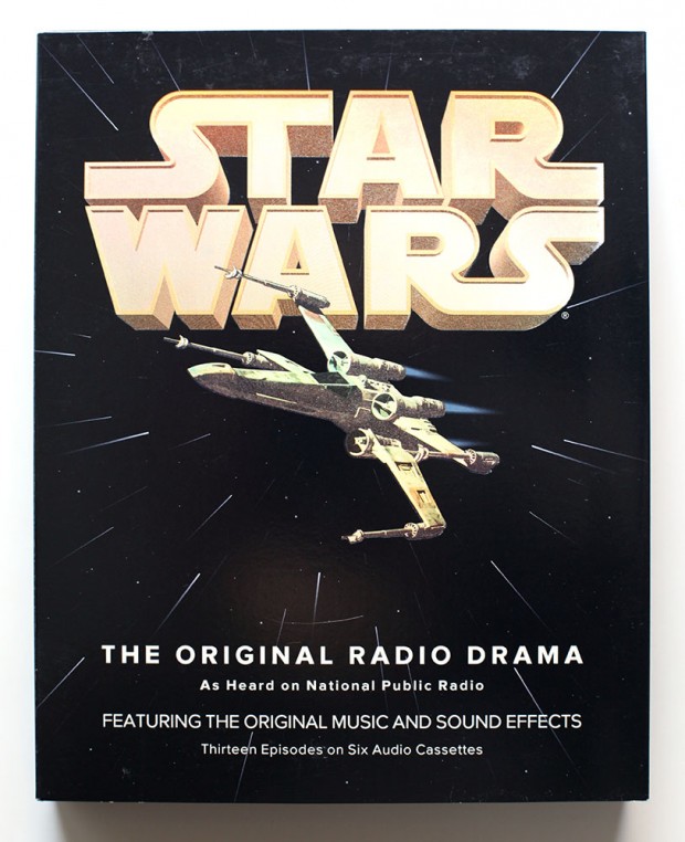
Mark Simonson:
Back then I was also working an early version of Proxima Nova, which at the time I was calling Visigothic. I had tried some different fonts for the Star Wars packaging, including ITC Avant Garde Gothic and News Gothic, but nothing looked quite like what I wanted. On a whim, I tried Visigothic. It was plain (like News Gothic) and also a bit geometric (like Avant Garde). It felt a little weird using my unfinished type design for the project, but it seemed to work. I showed it to the other people I was working with and they thought so, too. So I used it.
To oczywiście również czcionka, którą czytajcie jak odwiedzacie Makowe ABC w przeglądarce. Przeczytajcie sobie cały artykuł Marka – świetna historia.
Zdjęcie: Mark Simonson


Chcesz zwrócić mi na coś uwagę lub skomentować? Zapraszam na @morid1n lub na forum.